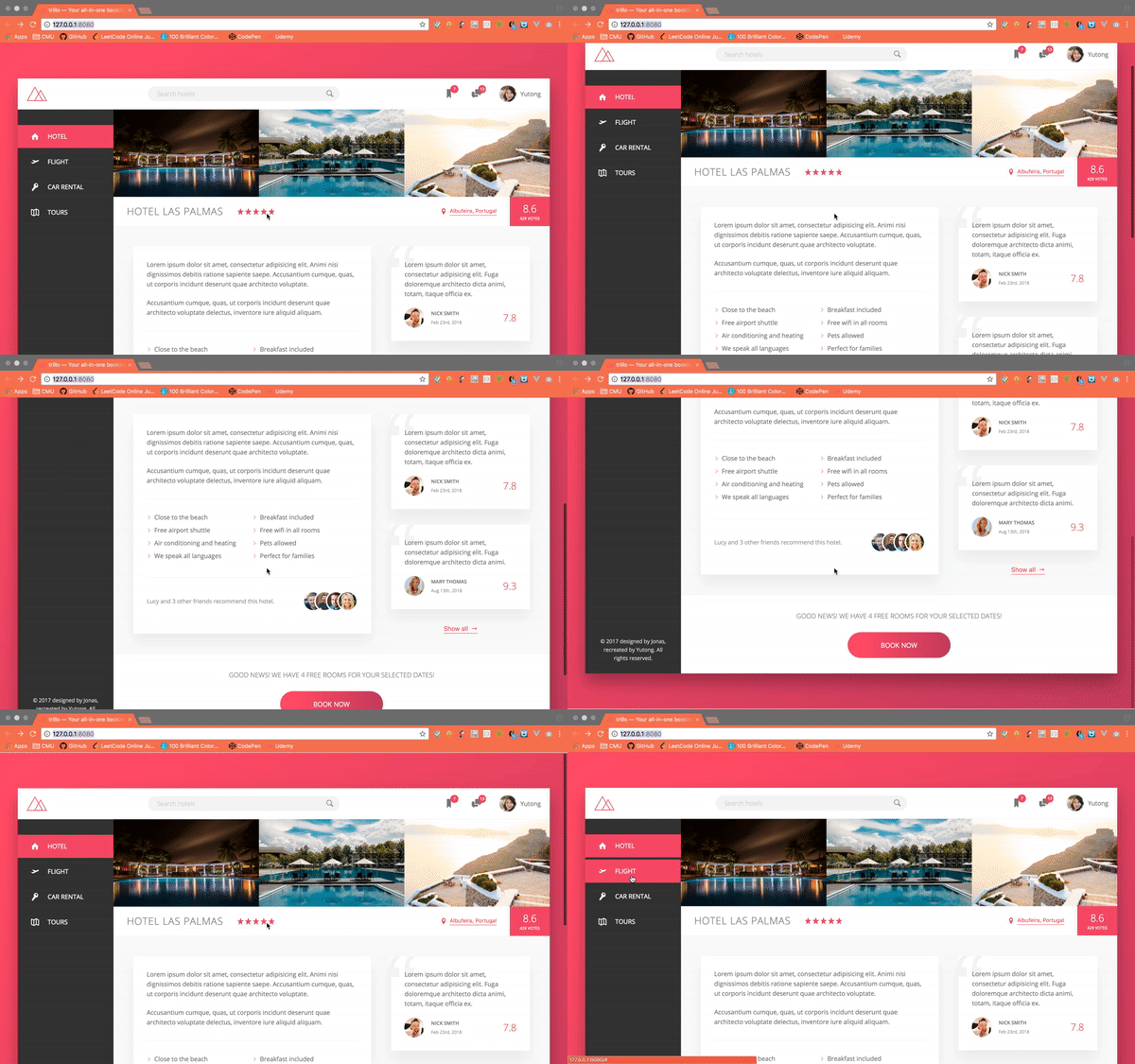
Today’s notes is for the Section 7, Lecture 72-88 of this udemy course.
Trillo Project
The project is a assignment / course content for the Udemy course. It fully implements the flexbox layout into everywhere of this webpage, meanwhile introduces some modern and cool CSS effects. The notes taken will focus more on the tricks used while building the project.

Use SVG library
Use SVG other than img can be benefitial in a lot of ways, it’s a more safe way to have image showing independentally from the network access, the file has to be load is much lighter, the icon / shape itself can be much more flexibly styled.
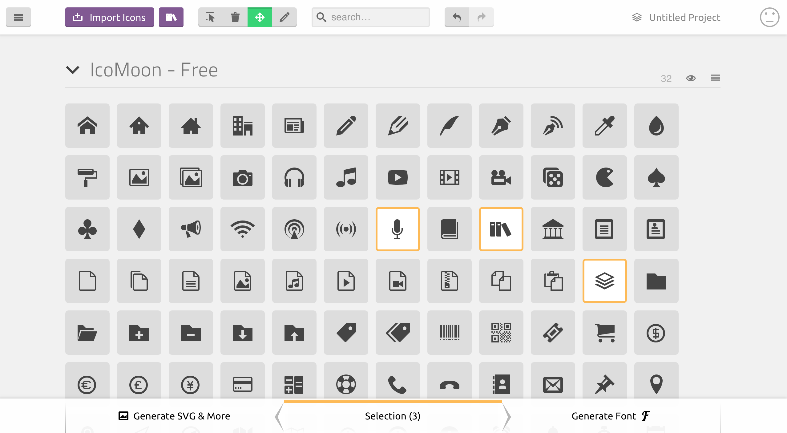
First, select the icons from icomoon website, or upload your artworks. Then choose download SVG to get the zip file.

Then get the symbol-defs.svg file in the folder, which can be used as the library contains all the icons downloaded. In the code directly use:
1 | <svg> |
The name(like icon-magnifying-glass) for each icon you selected can be looked up in the demo html file included in the folder as well.
Navbar on top
1 | <header class="header"> |
Use flex box to place the three different parts.
1
2
3
4
5
6
7.header {
...
display: flex;
justify-content: space-between;
align-items: center;
...
}Assign a fixed percentage to the search bar, the other parts will figure themselves out.
1
2
3
4
5.search {
...
flex: 0 0 40%; // no grow when space available, no shrink when space not enough, use 40% of the width (because flex-direction is set to 'row')
...
}Can even use flexbox just for vertically and horizontally center align items.
1
2
3
4
5
6
7
8
9
10.user-nav {
...
&__notification {
...
display: flex;
justify-content: center;
align-items: center;
}
...
}Use
align-selfto specify the starting point for alignment for the element.1
2
3
4.user-nav {
align-self: stretch; // take the whole space on the y axis (the cross axis)
...
}
Sidebar
1 | <nav class="sidebar"> |
Of course the sidebar also use flexbox to align links and icons, more want to highlight the animation for hovering here. The logic behind is to have the ::before class for the icon, when hover, change the Y axis first, then the width.1
2
3
4
5
6
7
8
9
10
11
12
13
14
15
16
17
18
19
20
21
22.side-nav {
...
&__item::before {
content: "";
position: absolute;
top: 0;
left: 0;
height: 100%;
width: 3px;
background-color: var(--color-primary);
transform: scaleY(0); // have to specify it here to mark the normal state for animation to work.
transition: transform .2s,
width .4s cubic-bezier(1,0,0,1) .2s,
background-color .1s;
}
&__item:hover::before,
&__item--active::before {
transform: scaleY(1);
width: 100%;
}
...
}
Overview
1 | <div class="overview"> |
Other than specify the percentage of the element to control the layout, sometimes can simply use margin: auto to place the empty space somewhere to layout the elments neatly.1
2
3
4
5
6
7
8.overview {
display: flex;
align-items: center;
...
&__stars {
margin-right: auto; // all the empty space will be taken on the right side of this section
}
}
Details
1 | <div class="detail"> |
Place the elements into two columns like table.
Let each element take 50% of the width, then specify theflex-wrapto wrap the content.1
2
3
4
5
6
7
8
9
10.list {
...
display: flex;
flex-wrap: wrap;
&__item {
flex: 0 0 50%;
...
}
}Change the color of SVG
The logic is use it as a background mask of the color.1
2
3
4
5
6
7
8
9
10
11
12
13
14
15
16
17
18
19.list {
&__item::before {
...
//older browsers (without color change)
background-image: url(../img/chevron-thin-right.svg);
background-size: cover;
@supports (-webkit-mask-image: url()) or (mask-image: url()) {
//newer browsers
background-color: var(--color-primary); // the background color
-webkit-mask-image: url(../img/chevron-thin-right.svg);
-webkit-mask-size: cover;
mask-image: url(../img/chevron-thin-right.svg);
mask-size: cover;
background-image: none;
}
}
}Place images on top of one another
Have a border for each image, then margin each image using a negative value.1
2
3
4
5
6
7
8
9
10
11
12
13
14
15.recommend {
...
&__photo {
box-sizing: content-box;
height: 4rem;
width: 4rem;
border-radius: 50%;
border: 3px solid #fff;
&:not(:last-child) {
margin-right: -2rem;
}
}
...
}Place a quote symbol on the left top of the div
The point here is to use entity other than the actual ‘ “ ‘ as the content for the::beforeclass. Can look up the entity code here.1
2
3
4
5
6
7
8
9
10
11
12
13
14.review {
...
&::before {
content: "\201C";
position: absolute;
left: -1rem;
top: -2.75rem;
font-size: 20rem;
color: var(--color-grey-light-2);
font-family: sans-serif;
line-height: 1;
z-index: 1;
}
}
CTA
1 | <div class="cta"> |
The button is the most fun here. Have both text ready to use, then change the Y axis position to replace one another with animation effect, use overflow to hide the other text outside of the button.
1 | .btn { |